
what the vol spread hides
how charts oversimplify
People will message me with charts like this to ask my opinion of a pairs trade:
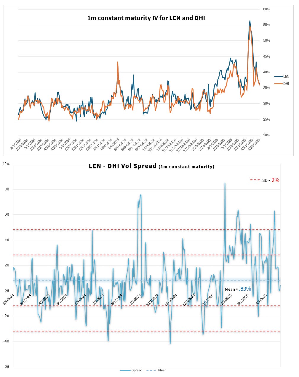
This is not a pair anyone sent me but the form is the same.
I guess-and-tested a few pairs whose daily return correlation is at least as high as some pairs I’ve been sent. In this case, I picked 2 homebuilders whose correlation over the last 500 calendar days turned out to be .90
[I used the hedge ratio tool from last Thursday to find this pair]
I respond to these messages with a few things that come to mind but I’ll flesh the responses out more in this post. Think of it as a map of data and interpretation pitfalls. There are bits in here for both novices and pros that’ll stimulate a “I never thought of that before”.
The charts above aren’t worthless but they’re very faint beeps on a metal detector during a beach stroll.
Let’s see why…
Thoughts as they come to me when I look at the chart…
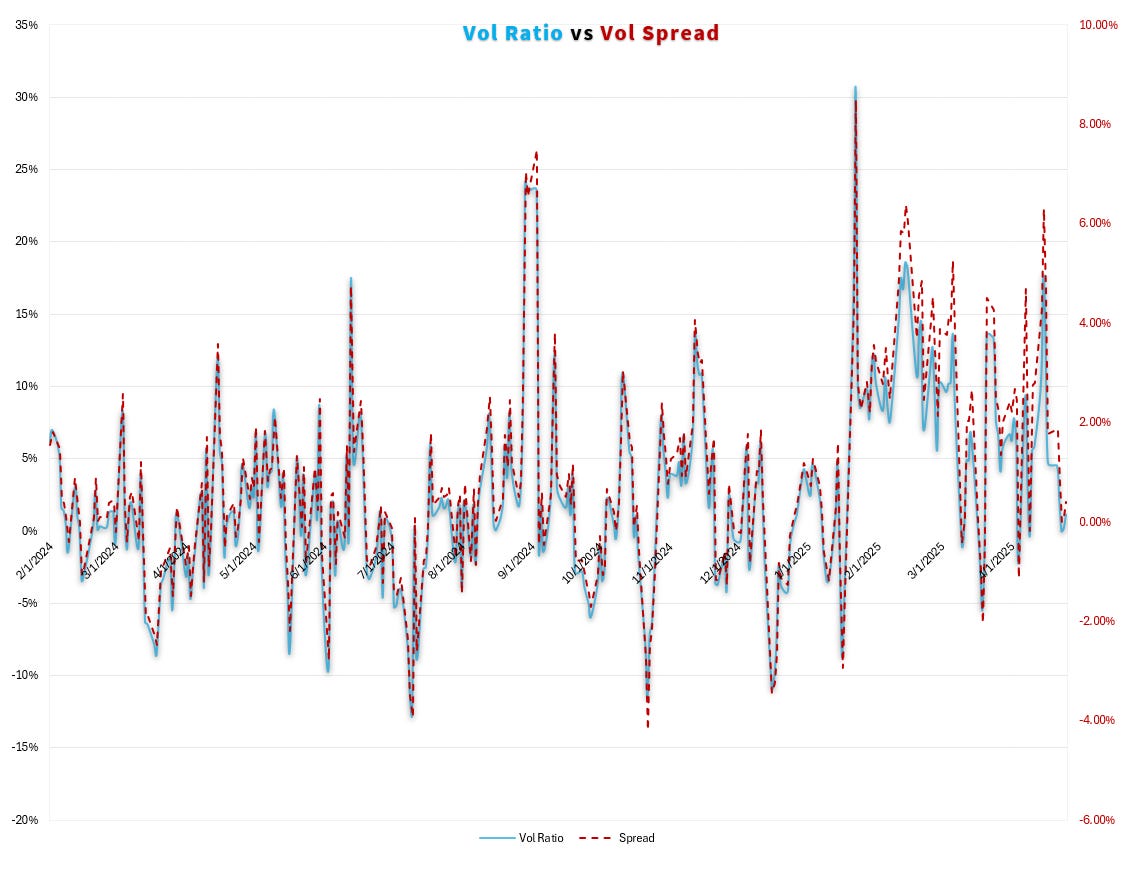
👁️The first thing my eyeballs say to my brain when looking at a vol spread chart is “why not a ratio chart?”. Over the period, the mean vol spread of LEN to DHI is +.83 and the vol level is about 40%
If vols doubled and the vol spread had the same average I’d be surprised, so a vol ratio strips out the level-dependant assumption that is silently suggested in a spread chart.
The nature of the relationship is of practical importance because it affects how you weight a pair. Any weighting scheme has trade-offs and matching the trade-offs to the bet you are expressing is, well, advisable.
I won’t rehash weighting here but both of these links go into it:
- Weighting An Options Pair Trade (moontower)
- To dollar-weight or share-weight a dislocation in a highly correlated pair? (moontower notes from Financial Hacking)
In this case, the spread and ratio seem good enough proxies for one another. A scatterplot rather than a time series would provide a more granular look but given the 30d maturity and no earnings extractions the extra granularity would probably cause us to overemphasize extremes that would probably be smoothed by arduous surface cleaning.
🔁Possible spot/vol artifacts
If LEN price drops relative to DHI I expect its vol will expand more than DHI. To the extent that a widening vol spread simply reflects recent price action we may deem the vol aberration “more justified” or “not an opportunity”.
Whether a widening vol spread being explained by a sell-off is meaningful or not is unavoidably context-dependent. If LEN falls relatively after earnings, I’d expect its vol spread to narrow from a wider reading that we likely sampled before earnings. But this is just an example of “news flash: lazy low-resolution charts are too underpowered for a trading thesis”.
That said, I do believe the idea of spot/vol mattering in terms of how much weight we’d give an aberration even qualitatively is at least relevant enough to pivot data in a few ways to understand the shape (or lack thereof) of a relationship.
Let’s play “charts plus thoughts”:
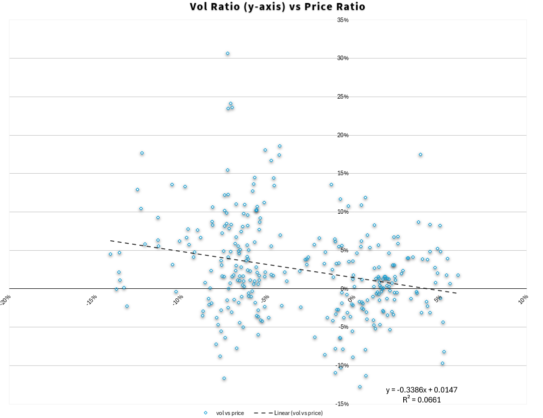
- We see a hint of vol/spot effects in the downward-sloping trendline. As LEN price increases relative to DHI its vol premium falls. But the r-square is trash. Weak relationship.
- This isn’t saying that spot-vol relationship in the stocks vs their vols is weak just that the vol ratio to price ratio relationship is weak. Remember these stocks’ returns are .90 corr. When LEN goes down, it’s vol expands but DHI usually goes down when LEN goes down (and its vol will likely be expanding as well in that case).
My background is in commodities where the spot/vol correlations in general are higher than they are in single stocks (but not as strong as equity indices which I’ll address a bit more below). Here’s just LEN IV vs spot
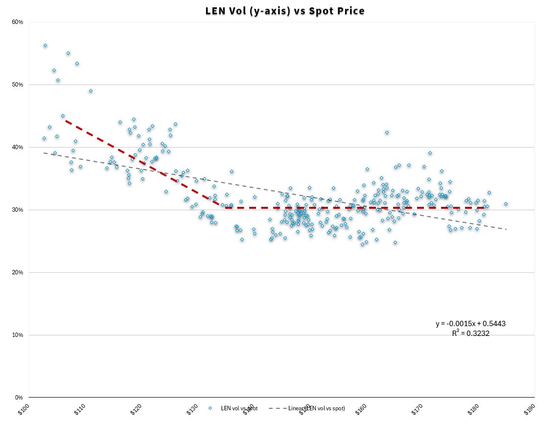
The grey trend line shows a weak relationship between spot and vol in terms of slope and a correlation that would be around .55-.60…but then I drew those red dashed lines because the story is really:
LEN is been like a 30% vol stock give or take 5 clicks in a price range of about $165 give or take 30% (ie an annual st dev). It sold off recently with the rest of the world and vol went up to 40% or about 1/3, as the stock stepped from one economic platform down to another.
As a matter of generalizable perspective:
All of this feels interesting from the altitude of an investor’s vantage point, but beneath the level of signal from a trading pov. The distinction is useful for any type of money decision — am I getting trader or investor resolution? Is the option trade I’m doing matched to a trader’s dashboard or an investor's?
The vol ratio vs price ratio chart showed a weak relationship. Not unexpected. LEN vols and price ratios are correlated. So instead let’s scatterplot the 1-month change in vol spread (our first chart said it’s a reasonable stand-in for ratio) vs the 1-month relative performance of LEN vs DHI directly. This is not about levels but about motion.
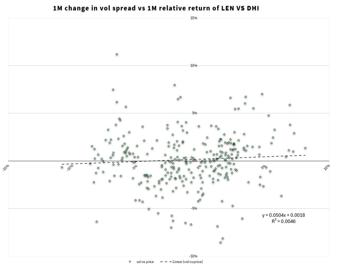
Honey badger, I mean the vol spread, don’t care. For a pair of 30% IV names that are 90 corr, 5%-10% relative performance is significant (can you use the risk-remaining lesson in last Thursday’s post to show that? The learning sticks if you apply it.)
And yet the scatter doesn’t validate the IV spread caring that much.
Let’s do a final chart before chatting.
We saw above that there’s a faint vol ratio to spot ratio relationship in the pair. As LEN goes up relative to DHI its vol ratio declines a touch but there’s a useless amount of noise from our distance.
Straddles are another way to look at vols and spot prices in a combined way. The approximation for a straddle price depends on vol, spot price, and DTE. DTE is constant. If spot and vol were negatively correlated with a -1 beta you’d expect straddle prices to stay constant over many price levels. If vol has a less than a -1 beta to spot then as price increases straddles increase and vice versa. Over large moves I always expect this to be the case.
For smaller moves, the constant straddle might hold as it often does in something like crude oil, a market where traders have a history of speaking in terms of straddles (or “breakevens” in case you ever wondered about Ari’s twitter name) instead of vol. In that market, discussing vol without price level is like owning one shoe.
For single stocks, this effect is going to be less pronounced. I expect straddle prices to rise with price as the spot effect in the straddle formula overwhelms the declining vol. Voila…the LEN - DHI straddle spread vs price ratio. Upward sloping af.
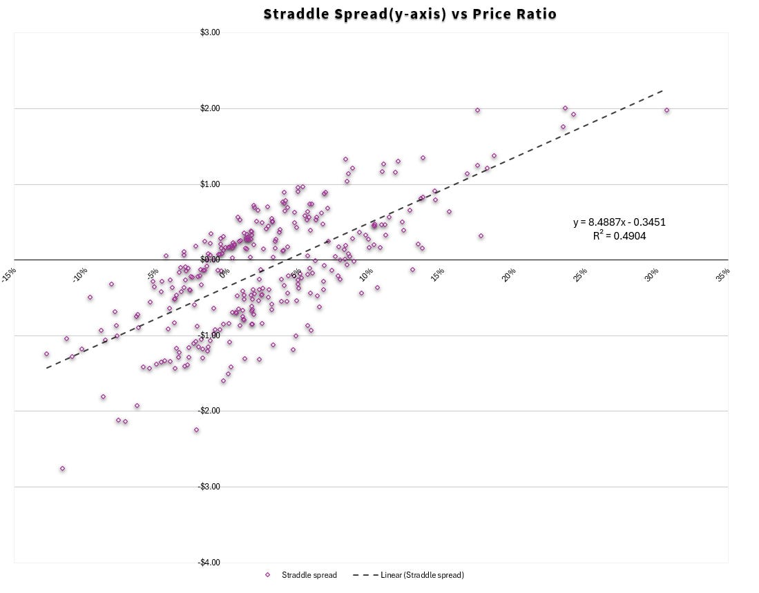
[Additional thought on this chart:
It likes like there are 2 channels which lovingly accommodate the trendline’s horny advance. I didn’t bother, but when you see things like that, it’s usually a clue to color code your dots by date. I don’t mean to abuse the metaphor but there are probably a couple periods of note here.]
🚧Detour on spot-vol correlation in single stocks
The spot-vol correlation in single stocks will vary by sector. The correlation looks fairly small in these homebuilders. We saw that directly in the spot/vol charts, the change in vol ratio vs change in spot ratio, the change in the vol spread vs change in relative performance, and in the strong positive relationship between straddle spread and price ratio suggesting straddles don’t stay constant but are driven by price more than vol.
One reason I could imagine homebuilders in particular having a muted spot vol relationship is they benefit demand side from lower mortgage rates. I’ll put my finger in the air and say they act like a levered 60/40 portfolio. They are diversified if stocks and bonds are anti-correlated.
[In fact, one way to potentially think of their vols is possibly from the quanto lens that one might think of pricing EWJ vol by considering the individual vols of Nikkei vs Yen. The options on EWJ relative to the legs imply a correlation between Japanese equities and FX — which is substantial in an export-led economy.]
Even though spot/vol corrs vary by sector, overall the skew and spot/vol correlations will be smaller than equity indices. Consider 2 reasons that derive from logic not vol surface data which only reflect the logic:
✔️Stock returns are positively skewed
Most companies go bankrupt. A few drive the total return of the indices. Black-scholes’ positive skew lognormal distribution is not a horrible description of companies…pump up the vol and it says, the median return is negative but there’s a long right tail. See Is There Actually An Equity Premium Puzzle?
✔️Average single stock skew must be less than index skew
An equity index is a portfolio of stocks. The vol of a portfolio depends on the vol is positively related to the vol of its constituents and their cross-correlation. If the correlation falls, all else equal, the portfolio vol falls.
Index downside skew must account for both pathways of vols increasing:
- The average stock in the basket’s vol increasing
- The cross-correlation of the stocks in the basket increasing
Most stocks share a systemic, undiversifiable risk — the possibility of the economy as a whole slowing down. This shared risk gets priced in index skew as an extra kicker over single stock skew because as correlation goes up, index vol increases faster than the increase in single stock vols.
Recast as a trading statement:
If you could sell all the single stock skew at the same level you could buy the index skew you'd be getting "correlation going to 1" for free.
What the vol spread chart hides
In traditional investing, we look at charts that prices travelling from the lower left to the upper right. We can’t feel the drawdowns along the green path it draws. Our eyes focus on the endpoints. Looks easy. All the suffering that you are getting paid for is eradicated, nothing but an expectation of profit for showing up remains.
This turns out to be (has been?) a salutory illusion. The chart makes it easy to buy while hiding the source of edge — a time horizon to not care about the dips. The time series of a mean-reverting vol spread does the same thing.
Let’s break down its lies.
🔮Snooping ahead
The mean and standard deviation are known for the sample period only after the sample period is over. If we transport ourselves to a place on the graph where it’s “obvious” to sell we are doing so with the benefit of hindsight. At the time of the trade, we didn’t know we were “there” on the finished chart. This insidious self-deception happens easily when we look at charts, don’t bring it with you when you move towards actually trading.
🧩Implied vol is only part of the puzzle.
The actual p/l of an option trade done to capture a vol discrepancy is a combination of:
- vega p/l or change in implied
- your realized p/l or what I call the “tug of war between your gamma and theta”. For a 1-month option the tug-of-war is going to have a large influence on your results but the chart’s thesis was IV driven.
If the market were strong-form efficient all the money you’d make on mean reversion of the IV spread would be lost on your realized vol p/l if the IV spreads perfectly predicted subsequent stock movements! I’m not saying that they do, I am saying that any focus purely on the IV spread only studying half the p/l drivers.
Discrepancies result from flow. Updating fair value based on flow is an inexact science, but to assume that the full amount of discrepancy is edge is the same as saying the flow has zero information.
🍦Vanillas are the real exotics
Vanilla options are messy. How?
- This time series is a constant maturity vol. To replicate it, you’d need to rebalance the options of the 2 expires bracketing 1-month on each trading day.
- As the spot prices of the pair move around, your moneyness and greeks change knocking your initial weighting off balance. Contrast this with a variance swap where holding time constant, your gamma is constant over the range of strike prices. The pricing is exotic but the experience is familiar because it ties mechanically back to a familiar calculation — the standard deviation of close-to-close returns. Vanilla pricing is familiar but the experience is exotic.
- You were trying to capture a vol discrepancy which means you probably want to delta-hedge to isolate the edge.
🩺Clinical vs practical
Maintaining a desired exposure in vanilla options requires rebalancing both the options and deltas. To do this faithfully every day as a taker would cost more than any perceived edge is paying.
This means in practice you must be willing to warehouse and tolerate noise. This means you must trade smaller for a given amount of edge if you want to maintain the same risk/reward of the clinically hedged expression.
In the real world, this type of trading is the domain of entities that can sell on the offer and buy on the bid, allowing them to leg the hard leg for edge (the liquidity of which will also be the limiting reagent on the trade).
If you are not a market-maker, trade the leg you have more conviction in or use the history to enter/exit the leg that fits into your overall portfolio more synergistically.
Last word
These charts should be thought of as indicators as opposed to backtests. The allure of these charts is they hint “backtest”. By peeling back their insidious, white lies, we can approach them with the right humility —they are clues. The opening statement in a trial, not the final verdict.