
Introducing Collar Workflows
Applying the volatility lens to collar trade intents
The Collar Workflow prices floors and caps together: buy a put, sell a call against it, and see what the pair costs — or what upside the call has to give up to make the pair free. It sits in the sidebar under Workflows → Collars.
Three panels: Screen (rank collars across your universe), Discover (the two legs plotted in vol-surface space), Build (one name's full zero-cost grid).
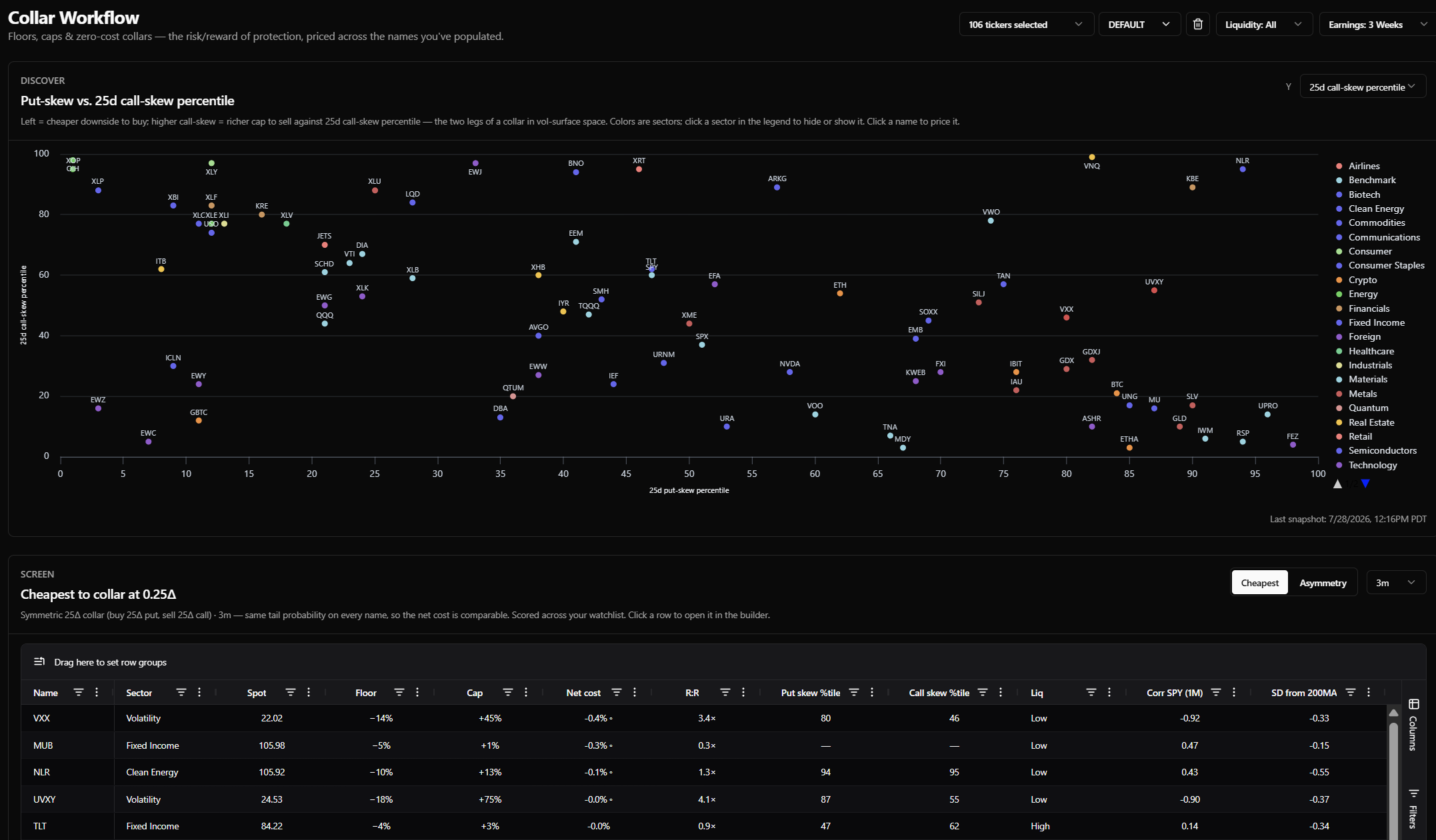
Scope controls
Same three as the other workflows: the ticker selector, the liquidity tier filter, and exclude earnings weeks.
1. Screen
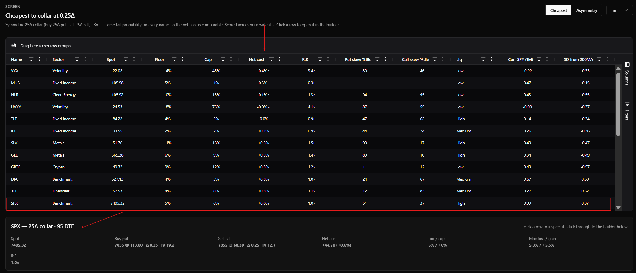
A symmetric collar on every name in scope — 25Δ put, 25Δ call, priced at the same tenor. Tenors are 1m, 3m, 6m and 12m.
Default columns: Name, Sector, Spot, Floor, Cap, Net cost, R:R, Put skew %tile, Call skew %tile, Liq, plus correlation to SPY and SD from 200MA.
Net cost is the put minus the call. Positive means the put trades over the call and you pay to put the structure on; negative means you collect. Sorting on it ascending puts the collars you get paid for at the top.
Clicking a row spotlights it in the card beneath the grid — both legs with their strike, delta, IV and mark, the net cost in dollars and as a percent of spot, the floor and cap, max loss and max gain, and the reward-to-risk ratio — and loads the name into the builder.
2. Discover
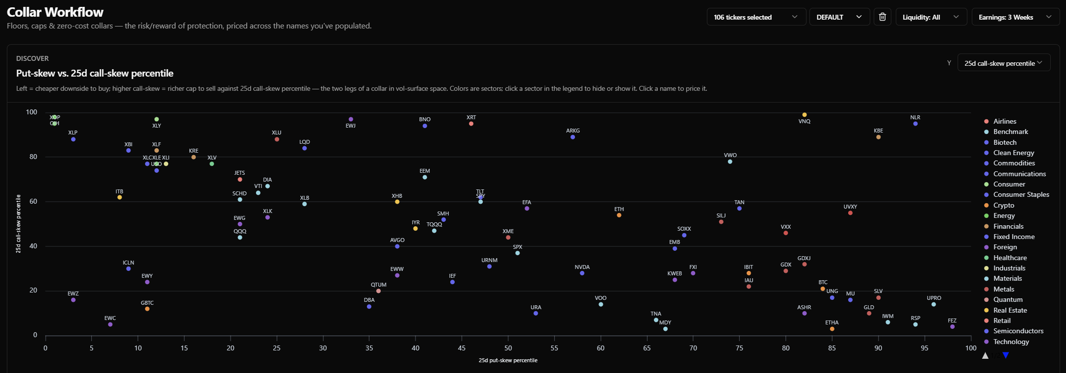
The collar's two legs plotted against each other. The X-axis is the 25d put-skew percentile — what you're paying for the floor. Y defaults to the call-skew percentile — what you're being paid for the cap — and can be switched to VRP, SD from 200MA, weekly return (z), IV 30d weekly change, correlation to SPY, or RV trend.
Dots are sector-colored and the legend filters the plot. The structural question the panel answers: where is the wing you're selling rich relative to the wing you're buying?
3. Build — the zero-cost grid
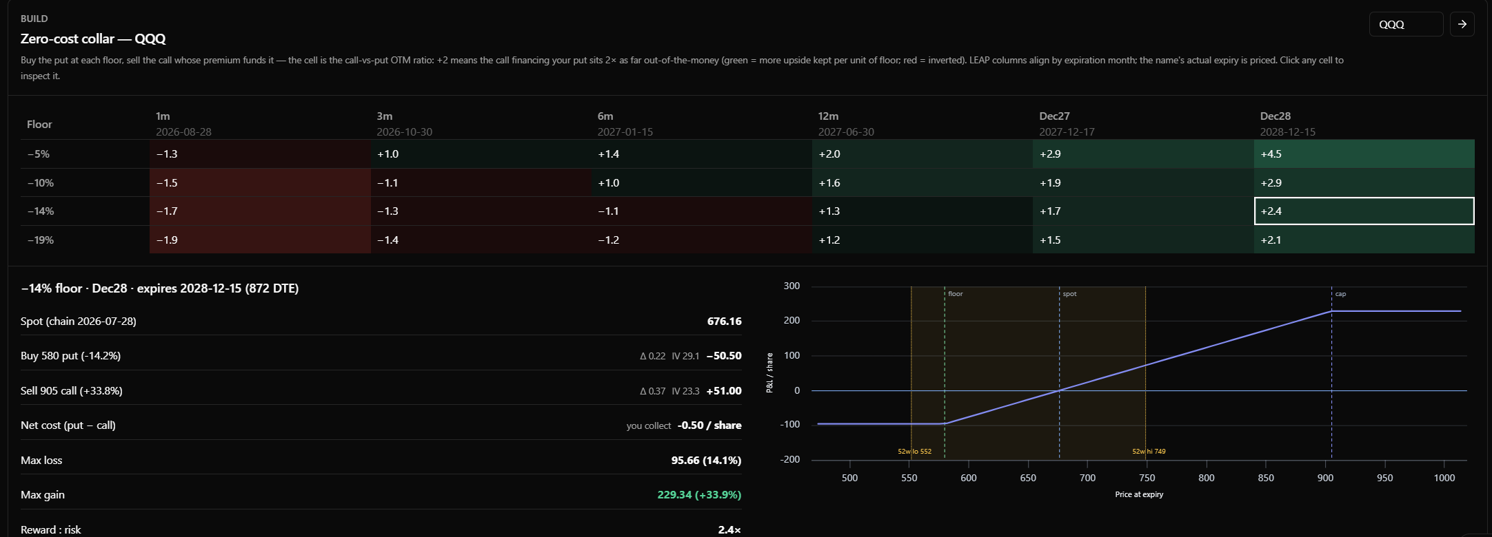
One name, one grid. Each row is a downside floor. For each floor, the tool buys that put and then solves for the call strike whose premium pays for it. The columns are tenors, with LEAP columns aligned by expiration month.
The number in each cell is the call-vs-put OTM ratio: how far out the financing call sits relative to the put you bought. A +2 means the call is twice as far out-of-the-money as the put — you kept twice as much upside room as the downside you gave up. Green is more upside kept per unit of floor; red is inverted, meaning you surrendered more upside than floor you bought.
"Zero cost" means the call premium lands within a small tolerance of the put's cost. The residual is carried through in the net cost figure rather than rounded away, so a cell labeled zero-cost still shows you the few cents it's actually off by.
Clicking any cell opens the detail beneath: spot, the put leg with its delta, IV and premium, the call leg with the same, the net cost per share labeled you pay or you collect, max loss, max gain, and a payoff diagram with the 52-week high and low marked so you can see where the floor and cap sit against the last year's range.
Metrics specific to this tool
Unlike Income and Defensive, there's no composite score here. A collar is ranked on its own economics — what the pair costs and what it pays — plus the two skew percentiles that explain why. The Collar Workflow marries investor intent with the "volatility lens" leaning on the two skew percentiles. They tell you whether the wing you're buying is expensive versus merely far away, and whether the wing you're selling is rich enough to pay for it.
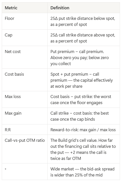
Everything else in the column roster — VRP, steepness, the IV and RV percentiles, RV trend, correlation to SPY, SD from 200MA, the weekly return and IV-change fields — is the same metric it is everywhere else in the app, carried here so you can build intersections without leaving the page.
Screening with the grid
- Filter on any column. Range filters on numbers, text on Name, checkboxes on Sector and Liq. Filters stack.
- Group by any column by dragging its header into the group bar.
- Choose your columns. The visible defaults are a fraction of what's there — max loss and max gain, both strikes, both marks, both deltas, both leg IVs, DTE, net cost in dollars and VRP are all one click away in the Columns panel.
- Sort on anything, including columns you added yourself.
- Save what you build. Name the current filters, sort, grouping, and columns and it comes back in one click. The same menu carries a set of read-only house screens we ship with the tool.
Choices persist between visits.
Example screens
The first two ship as house screens — pick one from the Screens menu and the filters, sort, and columns are set for you. The third you build yourself.
Collars you're paid to put on. Net cost < 0, SD from 200MA > 1.5. Extended holdings where the call finances more than the put costs — the market is paying you to cap and floor a position that has already run. Move to the 12m tenor, or open the Build panel for the LEAP columns, for the set-and-forget version.
Rich floor, flat cap. Put skew %tile > 80 against Call skew %tile < 40, sorted by Net cost. The structurally expensive version of a collar: you're paying up for the wing you buy and getting little for the one you sell. Reading it in reverse — cheap put skew against rich call skew — finds the opposite.
Best asymmetry per unit of floor. Sort by R:R descending with Liq restricted to High. Ranks by how much upside you keep against the downside you've capped, rather than by what the structure costs.