
Understanding Log Returns
The basics of log returns
If you draw a simple return at random from a normal (ie bell curve) distribution and compound it over time, the resultant wealth distribution will be lognormally distributed with the center of mass corresponding to the CAGR return.
Imagine your total 1-year return is 10%. So your terminal wealth is 1.10.
If you compounded monthly to end up at a terminal wealth of 1.10 we can compute the monthly compounding rate as:
1.10 ^ (1/12) = .797% per month or annualized (ie x12) = 9.57%
Let’s instead compound daily to end up with a terminal wealth of 1.10.
1.10 ^ (1/365) – 1 = .026% or annualized (x365) = 9.53%
The more frequently we compound while keeping the total return the same the lower the compounded rate or average rate that prevails to get us from initial to terminal wealth.
Log returns are returns compounded continuously (as if you were going to compound even more frequently than every single second but at a tiny rate). When we annualize that rate as we did in the prior examples we end up with a log return.
Or simply:
Ln(1.10) = 9.53%
Similar after rounding to just compounding daily.
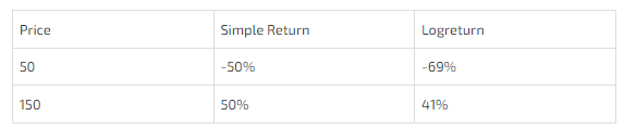
Let’s say your $1 grows to $1.50 after 1 year, then
- your simple return is 50%
- your log return is ln(1.5) = 40.5%
This chart reveals 2 facts:
- Log returns are always smaller than simple returns just as compounded returns are lower than simple returns. This makes sense because log returns are just compounding where the interval between compounding is reduced to zero so it takes a lower rate applied more frequently to get to the same total return.
Higher volatility (ie the larger changes) means a wider gap between the simple and log return. Again, reminiscent of the formula relating geometric and arithmetic returns.

The chart raises a question. We know that volatility increases the gap between simple and compounded returns but why is this exacerbated on the downside? There was nothing in the formula (CAGR = Arithmetic Mean – .5 * σ²) that points to any such asymmetry.
The answer lies in an illusion.
In the chart, 1.5 and .5 appear to be equidistant away. They are both 50% away, right?
That’s true…but only in simple terms!
In compounded terms, .50 is “further away” than 1.5.
A thought exercise will make this clear:
If I start at 100 and can only move in increments of 10%, I can get to 150 in 5 moves.
100 * 1.10 * 1.10 * 1.10 *1.10 * 1.10 = 1.61
But on the downside, compounding by a fixed amount means more moves to cover the same absolute distance.
100 * .9⁵ = 59
In fact, I need 2 more moves to “cross” 50. With 7 moves I finally get to 47.8
The chart masks the fact that in logspace .5 is much further than 1.5 and therefore to have moved 50% from the start the volatility (ie the move size) must have been higher. And that’s exactly what the log returns show:
Application to options
The analogy to options is the x-axis in this chart is strike prices because they are absolute distances apart. They are not equidistant apart in logspace!
Application to options
The analogy to options is the x-axis in this chart is strike prices because they are absolute distances apart. They are not equidistant apart in logspace!
We make the x-axis equidistant in logspace by making the log returns 10% apart.

Now we can chart the log returns on the x-axis. The distance of each total return from the diagonal shows the divergence between the log returns and simple return. It widens as you expect as we get to larger move sizes, but the chart is more symmetrical because the distance between the “strikes” is now normalized to compounded returns.
