
Scatterplot Gallery
A tour of SPY skew in pictures
Towards the end of Using Options Better, I promised:
If you fit a regression line between vol level and put skew you will see that skew flattens as vol increases. If you restrict your sample to a regime (say to when SPX vol is sub 10%) that line will be steeper. If you were looking to buy puts, every time vol was cheap, you might be deterred because skew was in the 75th percentile. But maybe that same skew is in the 40th percentile conditional on ATM vol being below 10%?
[I will pull the data and show this picture in another post but I’m writing this off the cuff]
I also touted scatterplots as a high yield way to examine data. Very efficient way to gain intuition. I specifically recommended color coding dots to restrict ranges allowing you to get a feel for conditional probabilities.
This post will have just enough words to guide you as as you sit over my shoulder at how I inspected SPY skew data going back to January 2022.
The data is materialized from moontower.ai.
Definitions
Normalized Skew
From Primer #8:
Normalized skew is simple ratio of the volatility at an out-of-the-money point on the curve to the at-the-money volatility. It is common to measure at skew at the 25 and 10 delta strikes both on the upside and downside of the volatility surface and use the 50 delta option to normalize. (note the 50d strike is often but not always the at-the-money strike)
For example, assume:
Strike: 50 delta, IV: 28%
Strike: 25 delta put, IV: 32%
Normalized skew = OTM volatility/ ATM volatility - 1
Normalized skew = 32%/28% - 1 = 14.3%The 25d put is trading at a 14% premium to the ATM volatility.
Risk Reversal
A risk-reversal is a common option structure sometimes known as a collar (or a fence if you are a futures psycho). It normally consists of buying an out-of-the-money put and selling an out-of-the-money call. [You can also do the opposite if you are bullish or collaring a short]
The metric I’ll use:
RR = Put skew - Call skew
In SPY, the put skew is typically large and positive. The call is typically negative indicating that OTM calls trade at a discounted IV from the .50 delta options.
Strangle
A strangle is an option structure that consists of buying or selling both an OTM call and OTM put. While the risk-reversal was the difference in call and put skew, our strangle measure sums them together.
Strangle = Put skew + Call skew
Depending how far OTM options are, you could think of the strangle measure as the premium for an outlier move. If you think about something like an insurance company — a lot of its risk doesn’t show up in how it moves on a daily basis which is well captured by straddles or ATM volatility. Instead, its largest concerns come from low probability or highly skewed outcomes. [See Lessons From A Skewed Coin to learn when volatility understates risk.]
Walking through the gallery
As a general observation in equities skew flattens as vol increases and vice versa. I know this from experience. But let’s look at some skew art. Our data is for 1-month 25d puts and calls for SPY from Jan 2022 through May 2024.
I’ll show a chart and throw in comments to keep us moving along.
First, the risk-reversal. It’s a popular measure of skew in sell-side distros.
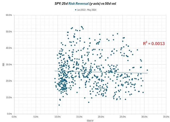
That’s a shotgun blast. Not a striking relationship between risk reversals and outright vol level.
Let’s decompose the chart for puts and calls.
Puts first:
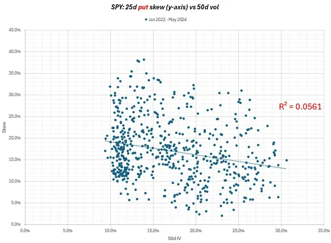
The put skew appears to have a higher high and higher low as the vol level bottoms out. Again not a strong relationship, but there’s some stickiness to downside vols. You can crush the .50d vol but the puts will hang in there a bit more.
How about the calls?
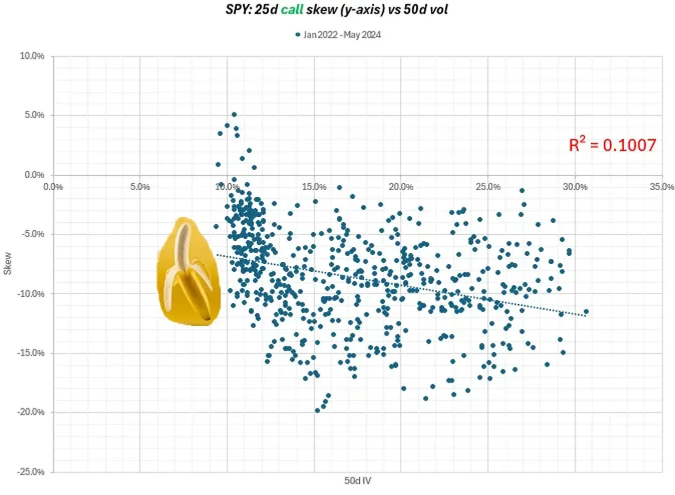
The R² is a bit higher but overall the relationship still doesn’t look strong.
But it’s a bit suspicious. As the vols get very low, the call skew even flips positive. And there’s that banana shaped cluster dominating the abundant low vol points.
This scatterplot covers almost 2.5 years. We should summon a time series to see what it has to say.
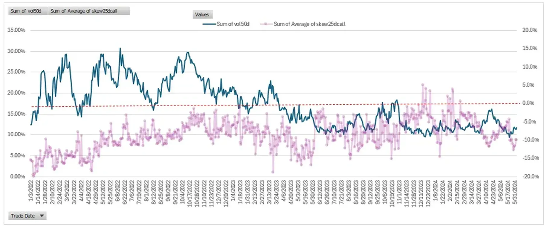
Ok, ok, kinda interesting.
- We see the elevated levels of SPY volatility from 2022 until a year ago May 2023. 2022 was the year of interest rate volatility, rates shooting higher, a housing pullback, and VC & crypto winters. Since then we had a minor pullback in equities (and uptick in vols) in Q3 of 2023 but it’s mostly been smooth sailing with vols searching for new lows.
- As vols circle the drain, the call skew has firmed. It has flattened from being less negative and even turning positive during some of Q4 2023. (You can also see the vols rallying this past April and call skew falling as a perfect reflection of each other.)
But what I’m seeing here is low vols for much of the past year and stronger call skew.
Perhaps it’s the banana?
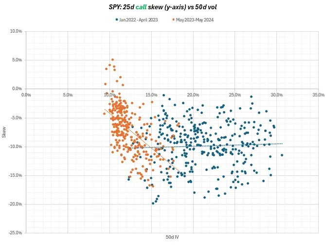
Apparently, the past year has been monkey time. The orange dots are May 2023 through May 2024.
It looks like 85% of the days have been less than 15% vol and the call skew is modulating up and down across the range with a high degree of elasticity.
Zooming in:
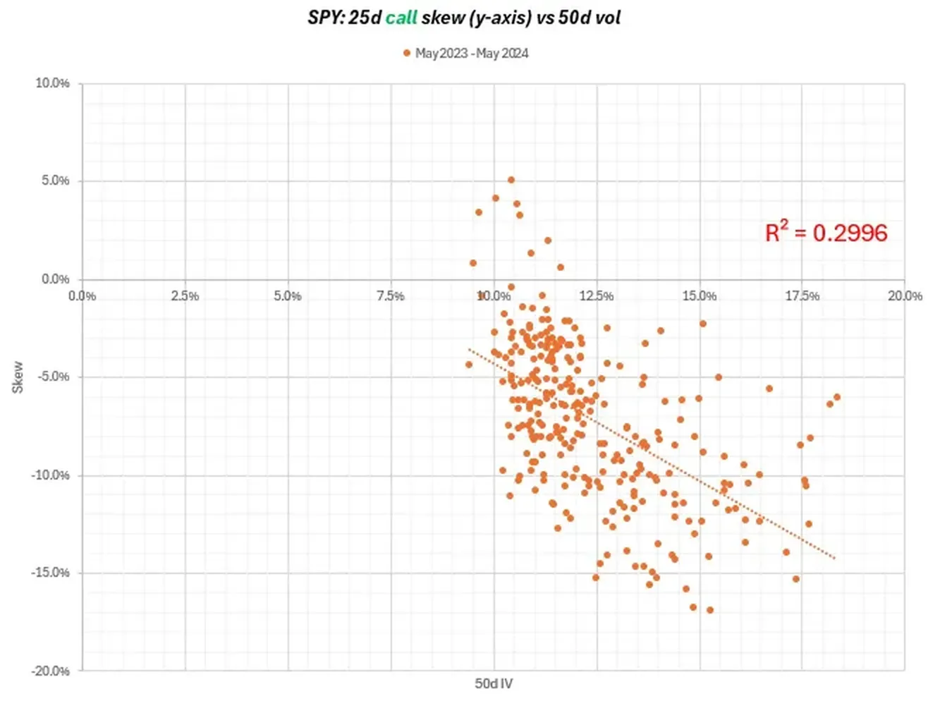
The R² says what our eyes see. The calls skew is definitely flattening or flippening as vols fall. Vols tend to fall as the market rallies and perhaps the stronger call skew is just the bullishness spilling over to the options. The “stock up, vol up” regime.
Other framings:
- Implied correlation is already so low, perhaps SPY calls simply have no lower to go on the upside without upside correlations being way too cheap at an absolute level, especially if single-stock calls are well bid.
- Absolute vols themselves are just resisting falling too far regardless of where they are on the surface. My bias is towards this explanation — there’s a point where cross-sectional views are just focusing on trees instead of the forest. Of course, I always felt this way before losing money owning “too cheap to erode” options. (It’s funny, sometimes when vols are high you hold your nose and buy them and I feel like it’s usually been the right call — which is telling. As my boy Fonz says, the good leg is the hard leg. But I always struggle to do the nose-hold trade to low vols thinking they’re cheap.)
And finally, how’s the strangle look compared to the vol level?
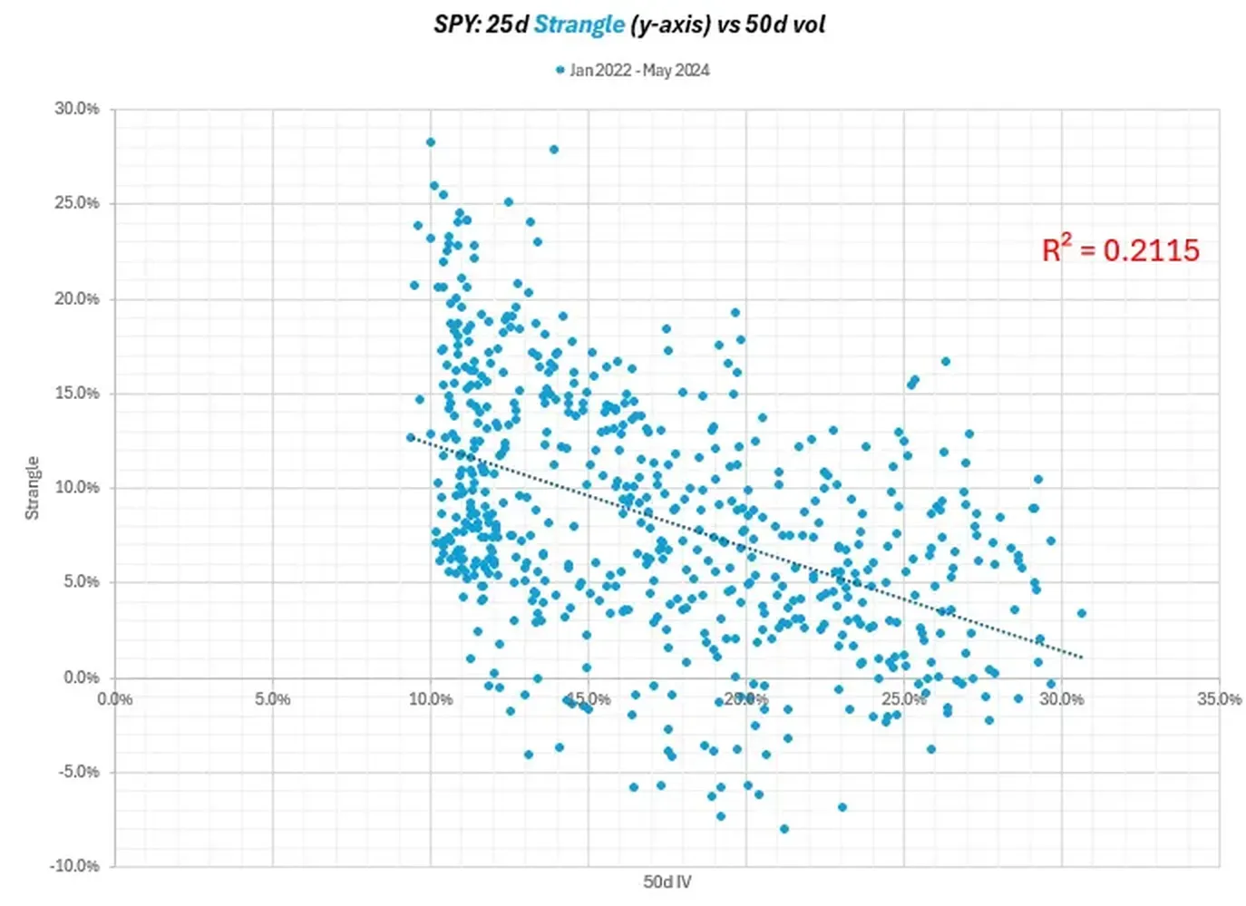
The strangle or sum of the skews shows flattening as vol increases.
Overall, we can see some level dependence to percent skews (ie skews that are normalized for vol level instead of measured as a spread to .50 delta vols).
I hope you enjoyed your visual tour.
A few parting words about trading, business, yada yada…
The relationships can vary greatly by regime and regimes themselves are driven of local competition equilibria (like the prominence of pod-driven dispersion trades if that indeed is supporting calls skew) and major flows (option selling ETFs come to mind these days).
It’s a reminder that this is and always will be biology not physics. In a world increasingly quant driven, the outputs are recycled as inputs even faster. The market internalizes current dynamics quickly — but this process also seeds the unraveling of regimes.
Whatever your doing, it’s good to ask yourself…in the current environment is there too many predators and not enough prey? Or vice versa?
- What does that knowledge suggest about how scenarios can unfold?
- How aggressive should you be in making hay now or investing for when the cycle comes back?
- How long can you survive biding time?
- How long do you think the other predators can survive?
- What does it depend on?
The most demanding part of a trading business might be the uneasy tension of optimism and paranoia. It’s not optional if you want to survive. Yet you only hear from one side at the top and the other side at the bottom. It’s the “plane with zits” problem. There’s a middle layer of quiet compounders who have all the damage but keep flying.
I suspect that’s true for most businesses. If not, something broke.