
Getting Paid To Flip Million Dollar Coins
How much would you bet on a favorable coin?
A foolproof way to get engagement is post this thing on Twitter every couple months. Sometimes my mood is to hate on such dredging but in this case, screw it, let’s take this sucker apart and see how many things we can learn from it.

Let’s start with the obvious.
- The expected value of choosing green is $25mm
- Many people would choose red. Some of those people know the expected value of green is $25mm and choose red anyway.
There’s no dissonance here. The red button guarantees an entirely new life to most of the world’s population. The green button means they still might have to set an alarm for work tomorrow.
The joy of wealth has diminishing returns. I just found $40 in a pair of pants I hadn’t worn in a while (plus a covid mask). If that happened 25 years ago, it would have been a serious enough discovery that I’d hoof it to the local bank branch with a deposit slip.
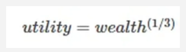
Economists talk about the “utility” of wealth. They will demonstrate the concept with a sub-linear function to relate “utils” to the quantity of wealth. It’s typically a logarithmic or power function. The sub-linear part means “if your wealth doubles your happiness increases but not by 2x”. The empirical shape of the function is something academics will split hairs about.
I’m going to make one up in the spirit of Nick Maggiulli’s post Climbing the Wealth Ladder.
We will say your “utils”, the made-up satisfaction units, are equal to the cube root of wealth:
Let’s start with the simplest chart.

- As your wealth goes up by 100x from $10k to $1mm this function says you get “only” about 5x happier.
- As your wealth goes up by 2,500x from $10k to $25mm this function says you get “only” about 13x happier.
The function is reasonable — happiness increases at a slower rate but maintains that more wealth is always better than less (which I’d describe as a “no-arbitrage condition” — if it wasn’t you could just give money away).
But just as you want to look at long term investing returns on a log chart (compounding is an exponential function), we want to compress the chart for a more zoomed out view. Plus, there’s a non-negligible number of 🌙 readers with more than $25mm and we want to be inclusive around here, right?
Let’s transform the wealth axis to a log(wealth) axis by invoking 10ˣ (ie $1,000 = 10³)

The underlying table:

We use log charts to frame insights in a more functional way.
By using log (base-10) to transform the wealth axis, we can now see what cube root utility means:
For every order of magnitude increase in wealth, your happiness doubles.
Your wealth goes up by 10x, your happiness increases by approximately 2x.
But another fun learning moment is upon us.
When I look at that semi-log chart I’m bothered because it’s still exponential. Utility is growing by 2ˣ.
In the case of exponential functions (like compounded returns in an investing context), a semi-log chart creates a straight line.
But a cube-root function is a power function. To get a straight line, we must use a log-log chart instead of a semi-log chart!
Let’s do that and see why such a transformation aids interpretation. First the table:

It’s handy use log (base-2) for the utility axis because utility is growing by 2ˣ
Here’s the log-log chart:

Observations:
- The x-axis is log base-10(wealth) and the y-axis is log base-2 (utility) and we get a straight line — that leads to an easy inference: Every order of magnitude in wealth doubles our happiness.
- It’s obvious why many would choose a guarantee of $1mm over an expected value of $25mm — if you have $10 today your happiness doubles more than 6x (it increases more than 50x, 2 to 100) over 5 orders of magnitude. Happiness only increase about 3x (100 to 292) between $1mm and $25mm. Those $24mm are worth less than the very first $1mm.
Of course, this utility function needn’t describe any individual but is qualitatively inferred from the idea that your lifestyle looks pretty similar until you climb to a higher order magnitude of wealth. We can quibble over the actual rate but unless you are a megalomaniac it’s almost certainly sub-linear.
Next time you see the red/green button question you can appreciate how people’s answers are self-rational despite any EV-maxing wonkiness.
Addendum
This walk-through showed how to select log transformations to convert exponential charts into linear charts and maintain intuition by saying things like
- “Y increases by a fixed rate for order of magnitude increases in X (log base-10)”
- “Y increases by a fixed rate every time X doubles (log base-2)”
Deriving the linear transformations of semi-log and log charts:
- Why exponential functions are linear on semi-log chartsStart by taking log of both sides of an exponential function:
Y = aX
Log(Y) = X log(a)
which looks like a line: Y = mX + b
where:
X log(a) corresponds to mX therefore slope or m= log(a) - Power functions are linear on log-log charts
Derivation by taking log of both sides of power function:
Y = aXb
log(Y) = log(aXᵇ)
log(Y) = log(a) + log(Xᵇ)
log(Y) = b log(X) + log(a)
which looks like a line: Y = mX + b
where intercept is log(a) and slope is the exponent b
The price this will trade for
Now if you have trader blood you look at the question above and say “I’ll just auction this red/green option off to the highest bidder.”
So what price do you think you’d get?
Let’s reason through this.
Someone that is truly risk-neutral is ambivalent between a certain $1mm and $1mm in expectancy.
The red button is worth $25mm so our risk-neutral friend Spock would not pay more than $24mm for the chance to push the button.
Proof of $1mm in expectancy if you pay $24mm:
.50 * -$24mm + .50 * $26mm = $1mm
Unfortunately, all we did was identify an upper-bound of $24mm that one might pay for this option.
But what do you think someone would actually pay?
🤔🤔🤔
Let’s make this more relatable and see if we can scale our logic up.
Imagine the green button guarantees just $1 and the red button is a 50% chance for $50.
Would you pay $24? Probably not unless you were risk-seeking but it’s not out of the question. I mean Robinhood has millions of users who trade for the lols and the E-trade babies were back in the Super Bowl ads.
Would you pay $23 to push the red button? $22? If you are unwilling to pay $20 please just close this tab right now.
What I’m getting at with this thought experiment is to have you feel that the answer to the question depends on:
- your bankroll (gambling with $20 is feasible and acceptable, gambling with your net worth not so much)
- your risk preferences
With this in mind we can move to the next section, where we’ll generate a concrete answer to the original question.
Kelly
$24mm to someone worth $100b is the same as $24 is to someone with $100k.
There’s 10 people in the world who can nonchalantly take this bet as easily as someone just gambles with $20.
But like finding the upper-bound of what someone might pay, this is barely a start.
This is actually a great place to use the Kelly Criterion. In short, the Kelly Criterion is a formula that prescribes the ideal percentage of your capital to wager. The prescribed fraction is the mathematical solution to “For a given amount of edge, how much should I bet to maximize my compounded growth rate?”
I created a collection for those who want to learn more (caveats, history, and much more):
…but for now we want to focus on our question.
The Kelly formula for what fraction of your bankroll to bet is simply:
f* = Edge / Odds
where
f* = bankroll fraction
Edge = expected return
Odds = percent profit when you win
If my original investment is $24mm and I expect to make $1mm then:
Edge = $1mm/$24mm = 4.17%
When I win I make $26mm for a $24mm bet:
Odds = 26/24 = 108.33%
f* = edge/odds = 4.17% / 108.33% = 3.85%
Kelly prescribes betting 3.85% of your capital on this proposition.
$24mm is 3.85% of a capital base of $624mm
The number of funds, trading firms, or even individuals who could reasonably take this bet is way larger than just the 10 richest people.
And remember this bet is a game — it’s uncorrelated with markets or economic growth. Trading firms diversify across bets like this all the time. As a market maker, I’d describe the business as “pay me $10,000 up front and I’ll flip a $1mm coin with you”.
If the coin is fair it’s worth $500k and I’m basically buying it for $490k or selling it for $510k. Either way I’m getting 2% edge.
My odds are $510k/$490k = 104.08%
The prescribed bet size is 2%/104.08% = 1.9% which is only half as good as the red button for $24mm! [Market-making biz in 1 sentence: Make a dime of edge on a $5 option a few dozen times a day, make sure the edge is real, and manage the risk.]
So yea, I expect this red button opportunity to trade for about $24mm by some large firm that is used to absorbing risk for a fee.
Byrne Hobart wrote a fantastic post recently in his educational Capital Gains letter that gets into related real-world messiness:
Matt Levine referenced it as well:
The Kelly criterion tells you what percentage of your money you should put on some favorable bet. If you work in financial markets, you want to make a bunch of bets where you think the odds are in your favor, and if you can estimate the odds then Kelly gives you a guide to how much of your money you should put on each bet. Kelly gives you an answer that is a percentage of your current bankroll. But what is your bankroll?
We talked a few times last year about a dumb story from Sam Bankman-Fried’s internship at Jane Street, where he kept making the maximum bet on slightly favorable coin flips, and I was like “well that’s not very Kelly is it.” But probably I was wrong. Jane Street interns were limited to losing $100 per day, so I sort of took $100 to be the size of his bankroll and thought he was aggressive to bet it all on a 51% coin flip. But readers pointed out, no, come on, his net worth at the time was not $100; $100 was nothing to him even though it was all he could bet that day. As a percentage of his actual bankroll that was a fine bet.
Anyway here is a fun post from Byrne Hobart titled “What’s the True Bankroll?” Sometimes the true bankroll is much bigger than the obvious bankroll: Sam Bankman-Fried’s $100 daily betting allowance was much smaller than his true bankroll, and Hobart points out that if you start your first job and have $1,000 to invest, your true bankroll is more like your lifetime expected savings than it is your current $1,000. Other times the true bankroll might be smaller than the obvious bankroll: If you are a portfolio manager at a multi-manager hedge fund, and you run a $500 million portfolio, you might think that your bankroll is $500 million. But if you know that you’ll get fired for a 10% decline in your portfolio, is your actual bankroll $50 million? No, but also maybe a little bit yes.
Learn more: